New on Tallo - Job Matches
New on Tallo - Job Matches
New on Tallo - Job Matches
Stride Inc.
1 month
UX Design
Stride Inc.
1 month
UX Design
Stride Inc.
1 month
UX Design

Introduction
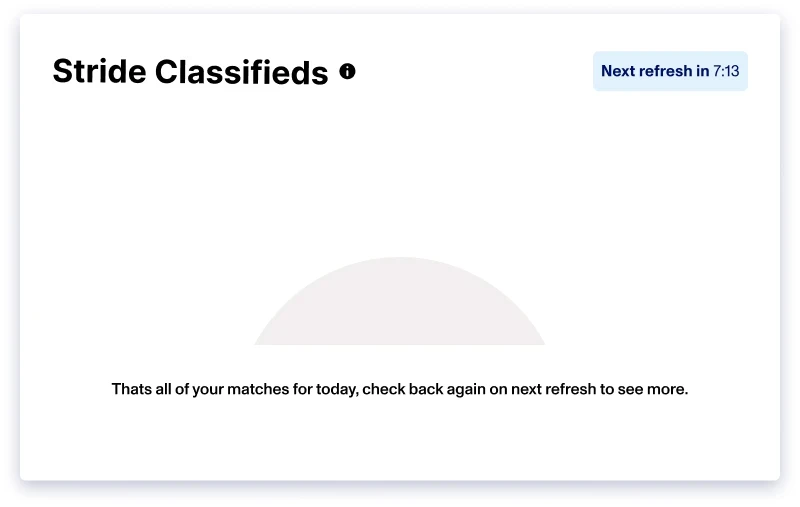
We set out to make the Stride Career Platform better, specifically by creating a dashboard that gave users job recommendations they would actually be excited about. The goal was to make finding a job less of a chore and more of a personal journey, where every suggestion felt like it was hand-picked just for them.
The Big Question
We had to figure out: How can we make job hunting not just easier, but also feel like it's tailored just for you, especially for our users fresh on the career path? Our answer was a system that got smarter the more you used it, learning what you liked and didn't like through a simple, delightful, and recognizable interaction.
Reworking Something Familiar

The idea was to make the platform inviting. We took inspiration from the easy swiping of dating apps and asked ourselves, how can we apply that to job searching? Writing for this feature was crucial—it had to be more than instructions. It was about making every swipe feel like a step toward the perfect job.
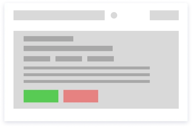
Crafting the First Iteration

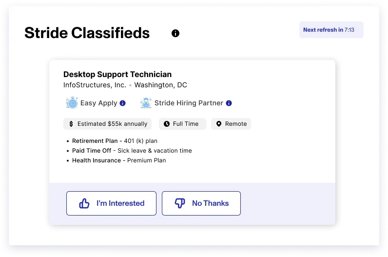
With our direction established, the next phase was to manifest our ideas into actual designs, complemented by the appropriate microcopy. Then we built our first version. It wasn't just about looks; the words on the screen had to guide and connect with the user. We made sure our instructions were clear: "Swipe right to see more jobs like this" or "Each swipe helps us find the right fit for you."
However, just one sentence couldn't cover the depth of the interaction. The copy needed to be engaging, informative, and intuitive. Users needed to feel they were in control and that their actions had a direct impact on their job recommendations.
Gathering Feedback
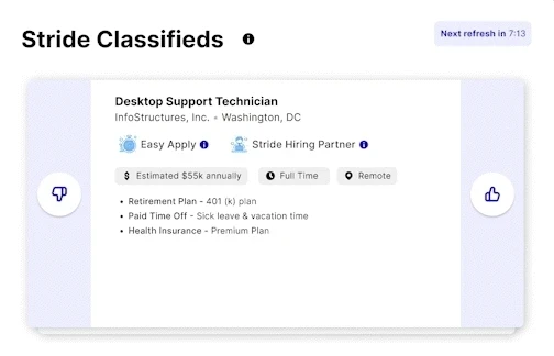
Feedback time was all about clarity. We wanted users to get that swiping was not just a cool feature but a tool for building a better job search. This led to tweaking our words and design to hit that sweet spot between fun and functional.
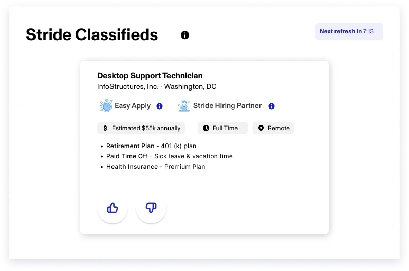
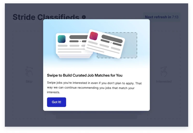
The feedback process highlighted the importance of clarity and engagement in the copy. For instance, 'Swipe right to like a job' was clear but lacked the engagement we were striving for. This led to revisions like 'Swipe to build curated job matches for you,' adding a dash of excitement to the action while maintaining clarity.
Handing off the Design
When it was time to pass the baton to the next designer, I laid out everything clearly. Every choice I made, from the swiping mechanism to the on-screen prompts, was detailed so that the next person could pick up right where I left off.
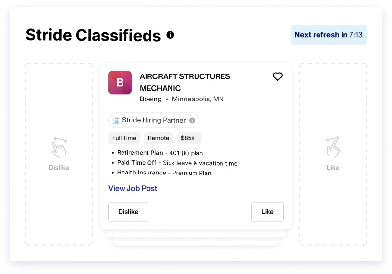
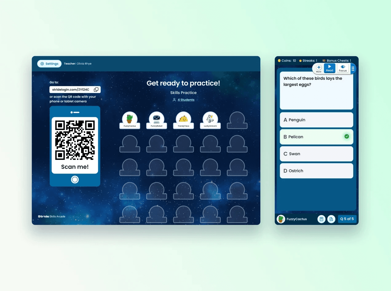
I ensured that each element of my wireframes was annotated with explanatory notes, detailing the function and rationale behind each design choice. However, I wasn't just providing a blueprint; I also aimed to offer a vision of how the feature would come alive within the user's dashboard.
To bridge any potential gaps between design and development, I created a sample animation demonstrating the 'swipe' feature in action. This visual aid, coupled with the accompanying copy, painted a holistic picture of the intended design, ensuring our developers could fully comprehend the feature's user experience. Through this comprehensive approach, I made sure that the essence of the initial concept was retained and accurately translated into the final design.
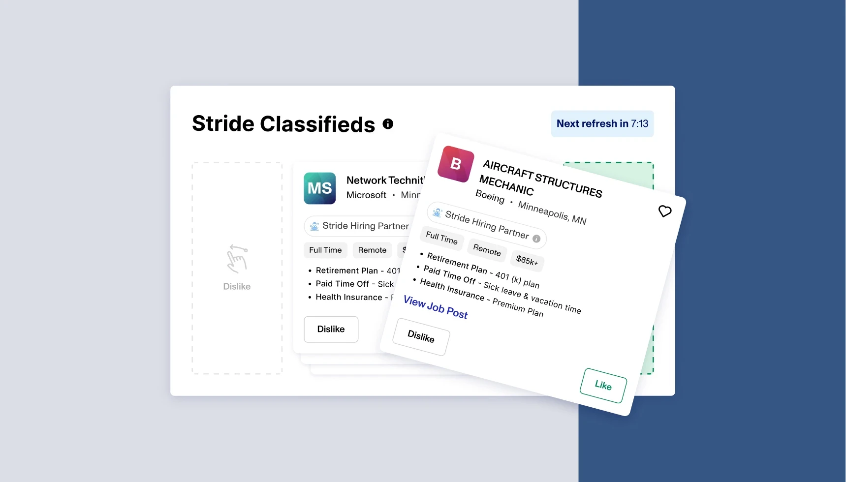
Phase Five: The Final Product
With the handoff successfully completed, the final design iterations were pushed to production. Witnessing my initial concepts undergo further refinement and evolution, thanks to the input from the team, was a rewarding part of the process. It was a testament to how collaborative efforts could truly enhance and fine-tune a feature, resulting in a seamless and intuitive user experience.
Seeing our project come to life was awesome. The design and text came together to make a feature that wasn't just new but something that really spoke to our users. It felt great to see the platform evolve into a place where users could enjoy finding their next job.
Reflection
Reflecting on the Stride Career Platform project, it's evident how each challenge became an opportunity for growth. The constraints of time underscored the importance of agile decision-making and sharpened my ability to prioritize essential features. It was a balancing act between the ideal user experience and the practicalities of project timelines.
Incorporating accessibility into the design required us to think deeply about our users' diverse needs, pushing us towards more thoughtful, inclusive design choices. This collaborative effort proved that great design isn't just about aesthetics; it's about creating experiences that everyone can navigate with ease and delight.
As the project wrapped up, it was gratifying to see the abstract concepts developed into concrete, user-centric features. It reinforced my belief in the power of iterative feedback and the critical role of clear, engaging communication to bridge the gap between design and functionality. The project was not only a lesson in UX design but also in the art of bringing a vision to life through patient iteration and teamwork.
Introduction
We set out to make the Stride Career Platform better, specifically by creating a dashboard that gave users job recommendations they would actually be excited about. The goal was to make finding a job less of a chore and more of a personal journey, where every suggestion felt like it was hand-picked just for them.
The Big Question
We had to figure out: How can we make job hunting not just easier, but also feel like it's tailored just for you, especially for our users fresh on the career path? Our answer was a system that got smarter the more you used it, learning what you liked and didn't like through a simple, delightful, and recognizable interaction.
Reworking Something Familiar
The idea was to make the platform inviting. We took inspiration from the easy swiping of dating apps and asked ourselves, how can we apply that to job searching? Writing for this feature was crucial—it had to be more than instructions. It was about making every swipe feel like a step toward the perfect job.
Crafting the First Iteration
With our direction established, the next phase was to manifest our ideas into actual designs, complemented by the appropriate microcopy. Then we built our first version. It wasn't just about looks; the words on the screen had to guide and connect with the user. We made sure our instructions were clear: "Swipe right to see more jobs like this" or "Each swipe helps us find the right fit for you."
However, just one sentence couldn't cover the depth of the interaction. The copy needed to be engaging, informative, and intuitive. Users needed to feel they were in control and that their actions had a direct impact on their job recommendations.
Gathering Feedback
Feedback time was all about clarity. We wanted users to get that swiping was not just a cool feature but a tool for building a better job search. This led to tweaking our words and design to hit that sweet spot between fun and functional.
The feedback process highlighted the importance of clarity and engagement in the copy. For instance, 'Swipe right to like a job' was clear but lacked the engagement we were striving for. This led to revisions like 'Swipe to build curated job matches for you,' adding a dash of excitement to the action while maintaining clarity.
Handing off the Design
When it was time to pass the baton to the next designer, I laid out everything clearly. Every choice I made, from the swiping mechanism to the on-screen prompts, was detailed so that the next person could pick up right where I left off.
I ensured that each element of my wireframes was annotated with explanatory notes, detailing the function and rationale behind each design choice. However, I wasn't just providing a blueprint; I also aimed to offer a vision of how the feature would come alive within the user's dashboard.
To bridge any potential gaps between design and development, I created a sample animation demonstrating the 'swipe' feature in action. This visual aid, coupled with the accompanying copy, painted a holistic picture of the intended design, ensuring our developers could fully comprehend the feature's user experience. Through this comprehensive approach, I made sure that the essence of the initial concept was retained and accurately translated into the final design.
Phase Five: The Final Product
With the handoff successfully completed, the final design iterations were pushed to production. Witnessing my initial concepts undergo further refinement and evolution, thanks to the input from the team, was a rewarding part of the process. It was a testament to how collaborative efforts could truly enhance and fine-tune a feature, resulting in a seamless and intuitive user experience.
Seeing our project come to life was awesome. The design and text came together to make a feature that wasn't just new but something that really spoke to our users. It felt great to see the platform evolve into a place where users could enjoy finding their next job.
Reflection
Reflecting on the Stride Career Platform project, it's evident how each challenge became an opportunity for growth. The constraints of time underscored the importance of agile decision-making and sharpened my ability to prioritize essential features. It was a balancing act between the ideal user experience and the practicalities of project timelines.
Incorporating accessibility into the design required us to think deeply about our users' diverse needs, pushing us towards more thoughtful, inclusive design choices. This collaborative effort proved that great design isn't just about aesthetics; it's about creating experiences that everyone can navigate with ease and delight.
As the project wrapped up, it was gratifying to see the abstract concepts developed into concrete, user-centric features. It reinforced my belief in the power of iterative feedback and the critical role of clear, engaging communication to bridge the gap between design and functionality. The project was not only a lesson in UX design but also in the art of bringing a vision to life through patient iteration and teamwork.
Buy Template
Buy Template
Preview
Preview
Other Projects
© Copyright 2023. All rights Reserved.
© Copyright 2023. All rights Reserved.

Available for Work
Available for Work