Stride Skills Arcade - Redefining Live Quizzing
Stride Skills Arcade - Redefining Live Quizzing
Stride Skills Arcade - Redefining Live Quizzing
Stride Inc.
3 months
UX Design
Stride Inc.
3 months
UX Design
Stride Inc.
3 months
UX Design


Introduction
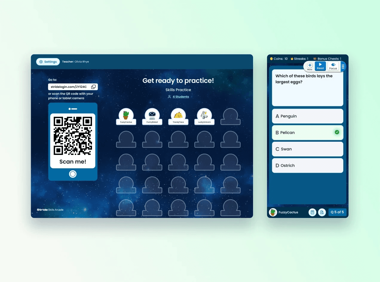
Stride Inc. embraced the challenge of revolutionizing the educational space with Stride Skills Arcade, a live quiz application aimed at making learning an electrifying experience. Our vision was a symbiotic tool that not only captivates students with the thrill of the game but also empowers teachers with insightful analytics and easy classroom integration.
Challenge and Approach

The challenge was multifaceted: How to enhance the live quiz experience in K-12 education? Our approach was systematic, embracing thorough research, iterative design, and continuous validation. We recognized that a nuanced understanding of both student engagement and teacher facilitation was paramount, so we embarked on a journey to uncover the precise blend of excitement and educational value that would define our product.
Solution

We met our challenges with a clear-cut plan: get to know our users and the competition inside out. First, we dived deep into research, chatting with our audience, and putting our heads together for some serious brainstorming. We mapped out detailed profiles and stories for our users — like mini-biographies — to really step into their shoes.
Then it was all about bringing those ideas into the real world. We sketched out our first versions of the quiz, from the basic layout to the interactive bits, and put those early designs — called wireframes — through their paces. Real users got their hands on these prototypes, poking holes and giving praise, which was gold for making things better. We kept in constant touch with the folks building the software to make sure we could get it off the ground without a hitch.
Deep-Dive Research

Our research phase was two-pronged, focusing on student desires for a competitive yet enjoyable learning environment, and teacher needs for straightforward implementation and insightful analytics. Immersing ourselves into these roles, we conducted interviews, sent out surveys, and engaged in observational studies. The insights gained were transformative, directly influencing feature selection, interface design, and ultimately, the product's trajectory.
We distilled our findings into clear user personas—each representing a segment of our audience with distinct motivations and challenges. This became our north star, guiding every design decision from feature ideation to interface layout.
Creative Ideation

The ideation phase was a dynamic dialogue of creativity. We held brainstorming sessions ripe with sketches and debates, ensuring that every voice was heard. Our initial designs, born on digital whiteboards and sticky notes, gradually took shape, considering various scoring mechanisms and game dynamics that would resonate with users.
We navigated through this phase with both imagination and meticulous attention to our users' feedback, always circling back to the fundamental question: Will this feature enhance the learning and teaching experience?
Strategic Competitive Analysis

Turning to our competitors, we didn’t just catalog features—we dissected experiences. Studying platforms like Kahoot and Quizlet provided us with a canvas of what to emulate and what to avoid. Our analysis highlighted gaps in existing offerings, especially around the ease of curriculum integration, which we identified as an opportunity for innovation.
We pored over user feedback from competitor platforms, which uncovered desires for more varied question types and clearer answer explanations. These insights were invaluable, informing a design philosophy that prioritized flexibility and clarity.
Iterative Design Process

Our design iterations were a delicate dance of form and function. The first iteration brought our collective vision into a tangible form, translating abstract ideas into concrete features. We meticulously crafted each quiz element, from the question display to the timer, prioritizing usability without sacrificing aesthetic appeal.
The teacher dashboard, a cornerstone of our design, was iterated upon to strike the right balance between depth of information and simplicity of use. We sketched, wireframed, and tested, refining our designs with each piece of user and stakeholder feedback.
Feedback Integration and Finalization

Each round of feedback was a springboard for improvement. We turned critiques into features and suggestions into action points. Incorporating animations and sounds, we crafted a more immersive quiz experience, and by simplifying navigation, we made the platform more approachable for younger students.
The customization features for teachers were expanded to allow them to adapt quizzes for different learning environments and student needs, reflecting our commitment to the educators' experience.
For example, our scoring system was initially simple and straightforward, but feedback suggested a more diverse and engaging system could enhance user experience. Based on this, we expanded the system to include levels, badges, and power-ups, transforming it from a mere scoring system into an integral part of the game.
Some key suggestions included:
"The interface could benefit from a more engaging design. Consider using vibrant colors, animations, and sounds to create a more immersive experience for students." - Graphic Designer
"It would be helpful to simplify the navigation and include clearer instructions, making it more accessible for younger students and easier for teachers to implement." - Product Manager
"Adding customization options for teachers would allow them to tailor quizzes to their curriculum and individual student needs, making the platform more versatile." - Teacher Consultant
"Consider incorporating a chat or messaging feature that would enable students to ask questions or collaborate with their peers during quizzes." - Developer
"The rewards system could be more diverse, offering different types of rewards to keep students engaged and motivated." - Marketing Specialist
These suggestions from our team helped guide us through the next steps in our design process, ensuring that the final product catered to the needs of both students and teachers while providing an enjoyable user experience.
Designing the Final Iteration

The feedback served as fuel for our second design iteration. We incorporated the team's suggestions, adding animations and sounds for a more immersive experience, and simplifying the navigation. One critical addition was the clear instructions to make the platform more accessible, especially for our younger users.
We also expanded the customization options for teachers, allowing them to tailor quizzes according to their curriculum. This decision was a direct response to the feedback about improving the teacher's control and ease-of-use of the platform.
Reflection and Learnings

In this project, tight deadlines were not inhibitors but catalysts, fostering a focus on essential features that cut through the noise and delivered utility. Starting with limited context forced us to become investigative, to delve deeply into user experiences, and to emerge with a design approach that was genuinely empathetic and user-centric.
The Stride Skills Arcade journey has been a testament to the transformative potential of design when underpinned by a deep understanding of user needs. It’s a narrative of how a well-researched, creatively inspired, and user-validated approach can turn a concept into a reality—a reality that’s ready to make its next leap forward, just like I am.

Introduction
Stride Inc. embraced the challenge of revolutionizing the educational space with Stride Skills Arcade, a live quiz application aimed at making learning an electrifying experience. Our vision was a symbiotic tool that not only captivates students with the thrill of the game but also empowers teachers with insightful analytics and easy classroom integration.
Challenge and Approach

The challenge was multifaceted: How to enhance the live quiz experience in K-12 education? Our approach was systematic, embracing thorough research, iterative design, and continuous validation. We recognized that a nuanced understanding of both student engagement and teacher facilitation was paramount, so we embarked on a journey to uncover the precise blend of excitement and educational value that would define our product.
Solution

We met our challenges with a clear-cut plan: get to know our users and the competition inside out. First, we dived deep into research, chatting with our audience, and putting our heads together for some serious brainstorming. We mapped out detailed profiles and stories for our users — like mini-biographies — to really step into their shoes.
Then it was all about bringing those ideas into the real world. We sketched out our first versions of the quiz, from the basic layout to the interactive bits, and put those early designs — called wireframes — through their paces. Real users got their hands on these prototypes, poking holes and giving praise, which was gold for making things better. We kept in constant touch with the folks building the software to make sure we could get it off the ground without a hitch.
Deep-Dive Research

Our research phase was two-pronged, focusing on student desires for a competitive yet enjoyable learning environment, and teacher needs for straightforward implementation and insightful analytics. Immersing ourselves into these roles, we conducted interviews, sent out surveys, and engaged in observational studies. The insights gained were transformative, directly influencing feature selection, interface design, and ultimately, the product's trajectory.
We distilled our findings into clear user personas—each representing a segment of our audience with distinct motivations and challenges. This became our north star, guiding every design decision from feature ideation to interface layout.
Creative Ideation

The ideation phase was a dynamic dialogue of creativity. We held brainstorming sessions ripe with sketches and debates, ensuring that every voice was heard. Our initial designs, born on digital whiteboards and sticky notes, gradually took shape, considering various scoring mechanisms and game dynamics that would resonate with users.
We navigated through this phase with both imagination and meticulous attention to our users' feedback, always circling back to the fundamental question: Will this feature enhance the learning and teaching experience?
Strategic Competitive Analysis

Turning to our competitors, we didn’t just catalog features—we dissected experiences. Studying platforms like Kahoot and Quizlet provided us with a canvas of what to emulate and what to avoid. Our analysis highlighted gaps in existing offerings, especially around the ease of curriculum integration, which we identified as an opportunity for innovation.
We pored over user feedback from competitor platforms, which uncovered desires for more varied question types and clearer answer explanations. These insights were invaluable, informing a design philosophy that prioritized flexibility and clarity.
Iterative Design Process

Our design iterations were a delicate dance of form and function. The first iteration brought our collective vision into a tangible form, translating abstract ideas into concrete features. We meticulously crafted each quiz element, from the question display to the timer, prioritizing usability without sacrificing aesthetic appeal.
The teacher dashboard, a cornerstone of our design, was iterated upon to strike the right balance between depth of information and simplicity of use. We sketched, wireframed, and tested, refining our designs with each piece of user and stakeholder feedback.
Feedback Integration and Finalization

Each round of feedback was a springboard for improvement. We turned critiques into features and suggestions into action points. Incorporating animations and sounds, we crafted a more immersive quiz experience, and by simplifying navigation, we made the platform more approachable for younger students.
The customization features for teachers were expanded to allow them to adapt quizzes for different learning environments and student needs, reflecting our commitment to the educators' experience.
For example, our scoring system was initially simple and straightforward, but feedback suggested a more diverse and engaging system could enhance user experience. Based on this, we expanded the system to include levels, badges, and power-ups, transforming it from a mere scoring system into an integral part of the game.
Some key suggestions included:
"The interface could benefit from a more engaging design. Consider using vibrant colors, animations, and sounds to create a more immersive experience for students." - Graphic Designer
"It would be helpful to simplify the navigation and include clearer instructions, making it more accessible for younger students and easier for teachers to implement." - Product Manager
"Adding customization options for teachers would allow them to tailor quizzes to their curriculum and individual student needs, making the platform more versatile." - Teacher Consultant
"Consider incorporating a chat or messaging feature that would enable students to ask questions or collaborate with their peers during quizzes." - Developer
"The rewards system could be more diverse, offering different types of rewards to keep students engaged and motivated." - Marketing Specialist
These suggestions from our team helped guide us through the next steps in our design process, ensuring that the final product catered to the needs of both students and teachers while providing an enjoyable user experience.
Designing the Final Iteration

The feedback served as fuel for our second design iteration. We incorporated the team's suggestions, adding animations and sounds for a more immersive experience, and simplifying the navigation. One critical addition was the clear instructions to make the platform more accessible, especially for our younger users.
We also expanded the customization options for teachers, allowing them to tailor quizzes according to their curriculum. This decision was a direct response to the feedback about improving the teacher's control and ease-of-use of the platform.
Reflection and Learnings

In this project, tight deadlines were not inhibitors but catalysts, fostering a focus on essential features that cut through the noise and delivered utility. Starting with limited context forced us to become investigative, to delve deeply into user experiences, and to emerge with a design approach that was genuinely empathetic and user-centric.
The Stride Skills Arcade journey has been a testament to the transformative potential of design when underpinned by a deep understanding of user needs. It’s a narrative of how a well-researched, creatively inspired, and user-validated approach can turn a concept into a reality—a reality that’s ready to make its next leap forward, just like I am.

Introduction
Stride Inc. embraced the challenge of revolutionizing the educational space with Stride Skills Arcade, a live quiz application aimed at making learning an electrifying experience. Our vision was a symbiotic tool that not only captivates students with the thrill of the game but also empowers teachers with insightful analytics and easy classroom integration.
Challenge and Approach

The challenge was multifaceted: How to enhance the live quiz experience in K-12 education? Our approach was systematic, embracing thorough research, iterative design, and continuous validation. We recognized that a nuanced understanding of both student engagement and teacher facilitation was paramount, so we embarked on a journey to uncover the precise blend of excitement and educational value that would define our product.
Solution

We met our challenges with a clear-cut plan: get to know our users and the competition inside out. First, we dived deep into research, chatting with our audience, and putting our heads together for some serious brainstorming. We mapped out detailed profiles and stories for our users — like mini-biographies — to really step into their shoes.
Then it was all about bringing those ideas into the real world. We sketched out our first versions of the quiz, from the basic layout to the interactive bits, and put those early designs — called wireframes — through their paces. Real users got their hands on these prototypes, poking holes and giving praise, which was gold for making things better. We kept in constant touch with the folks building the software to make sure we could get it off the ground without a hitch.
Deep-Dive Research

Our research phase was two-pronged, focusing on student desires for a competitive yet enjoyable learning environment, and teacher needs for straightforward implementation and insightful analytics. Immersing ourselves into these roles, we conducted interviews, sent out surveys, and engaged in observational studies. The insights gained were transformative, directly influencing feature selection, interface design, and ultimately, the product's trajectory.
We distilled our findings into clear user personas—each representing a segment of our audience with distinct motivations and challenges. This became our north star, guiding every design decision from feature ideation to interface layout.
Creative Ideation

The ideation phase was a dynamic dialogue of creativity. We held brainstorming sessions ripe with sketches and debates, ensuring that every voice was heard. Our initial designs, born on digital whiteboards and sticky notes, gradually took shape, considering various scoring mechanisms and game dynamics that would resonate with users.
We navigated through this phase with both imagination and meticulous attention to our users' feedback, always circling back to the fundamental question: Will this feature enhance the learning and teaching experience?
Strategic Competitive Analysis

Turning to our competitors, we didn’t just catalog features—we dissected experiences. Studying platforms like Kahoot and Quizlet provided us with a canvas of what to emulate and what to avoid. Our analysis highlighted gaps in existing offerings, especially around the ease of curriculum integration, which we identified as an opportunity for innovation.
We pored over user feedback from competitor platforms, which uncovered desires for more varied question types and clearer answer explanations. These insights were invaluable, informing a design philosophy that prioritized flexibility and clarity.
Iterative Design Process

Our design iterations were a delicate dance of form and function. The first iteration brought our collective vision into a tangible form, translating abstract ideas into concrete features. We meticulously crafted each quiz element, from the question display to the timer, prioritizing usability without sacrificing aesthetic appeal.
The teacher dashboard, a cornerstone of our design, was iterated upon to strike the right balance between depth of information and simplicity of use. We sketched, wireframed, and tested, refining our designs with each piece of user and stakeholder feedback.
Feedback Integration and Finalization

Each round of feedback was a springboard for improvement. We turned critiques into features and suggestions into action points. Incorporating animations and sounds, we crafted a more immersive quiz experience, and by simplifying navigation, we made the platform more approachable for younger students.
The customization features for teachers were expanded to allow them to adapt quizzes for different learning environments and student needs, reflecting our commitment to the educators' experience.
For example, our scoring system was initially simple and straightforward, but feedback suggested a more diverse and engaging system could enhance user experience. Based on this, we expanded the system to include levels, badges, and power-ups, transforming it from a mere scoring system into an integral part of the game.
Some key suggestions included:
"The interface could benefit from a more engaging design. Consider using vibrant colors, animations, and sounds to create a more immersive experience for students." - Graphic Designer
"It would be helpful to simplify the navigation and include clearer instructions, making it more accessible for younger students and easier for teachers to implement." - Product Manager
"Adding customization options for teachers would allow them to tailor quizzes to their curriculum and individual student needs, making the platform more versatile." - Teacher Consultant
"Consider incorporating a chat or messaging feature that would enable students to ask questions or collaborate with their peers during quizzes." - Developer
"The rewards system could be more diverse, offering different types of rewards to keep students engaged and motivated." - Marketing Specialist
These suggestions from our team helped guide us through the next steps in our design process, ensuring that the final product catered to the needs of both students and teachers while providing an enjoyable user experience.
Designing the Final Iteration

The feedback served as fuel for our second design iteration. We incorporated the team's suggestions, adding animations and sounds for a more immersive experience, and simplifying the navigation. One critical addition was the clear instructions to make the platform more accessible, especially for our younger users.
We also expanded the customization options for teachers, allowing them to tailor quizzes according to their curriculum. This decision was a direct response to the feedback about improving the teacher's control and ease-of-use of the platform.
Reflection and Learnings

In this project, tight deadlines were not inhibitors but catalysts, fostering a focus on essential features that cut through the noise and delivered utility. Starting with limited context forced us to become investigative, to delve deeply into user experiences, and to emerge with a design approach that was genuinely empathetic and user-centric.
The Stride Skills Arcade journey has been a testament to the transformative potential of design when underpinned by a deep understanding of user needs. It’s a narrative of how a well-researched, creatively inspired, and user-validated approach can turn a concept into a reality—a reality that’s ready to make its next leap forward, just like I am.

Buy Template
Buy Template
Preview
Preview
Other Projects
© Copyright 2023. All rights Reserved.
© Copyright 2023. All rights Reserved.


